

Redesigning a non-profit website to create a fresh look with intuitive features that accurately reflects the voice, mission, and impact of Project LEDO.
My Role
Lead UX Designer
Lead UI Designer
Team
Mikaela Corney (Design lead volunteer)
Gary Aldrich (UX research volunteer)
Uvie Adah (Design support volunteer)
Luisa Sastoque (Design support volunteer)
Timeline
2 months
January 2023-February 2023
Background
Project LEDO is a Portland, Oregon based non-profit organization whose mission is to provide access to science and technology programs for children from Black, Indigenous, People of Color and low-income communities. Since 2019, they’ve been offering hands-on programs in the Portland, Oregon metro area.
The Problem
The Solution
While Project LEDO has successfully been running programs for several years, our challenge was to revamp their current website to create a fresh look that incorporated their many brand colors. With some user research, 3 primary business needs were identified:
We re-designed the current Project LEDO website to create a unified visual design and intuitive navigation to ensure site visitors could more easily learn about the mission and see how their donation would make an impact. Ultimately, we want to establish trust and confidence in Project LEDO, driving donations, and empowering individuals to get involved. Final deliverables for the non-profit site include live published webpages in Squarespace, a customized hero banner gif made by me that provides a holistic overview of the different programs offered, plus a style guide to help with future implementation, when us volunteers step away from the project.
Not enough information:
Although the primary CTA (Call to Action) button for donations is easy to find, users are unclear about what they are donating to and how their funds are being used or making an impact.
Inconsistent UI:
Overall, pages had inconsistent visual design, from type sizes and titles to color choices. Information hierarchy was unclear and web pages were difficult to navigate.
Hard to find details:
Volunteers reported struggling to find the key info they needed to assess if they wanted to volunteer and how they could get involved.
The home page features a hero banner gif I made to captivate site visitors and immediately convey a sense of emotion. The gif also has the benefit of providing an overview of the different programs offered. As visitors scroll the homepage, they can hear from the founder, learn more about the most popular programs, and find ways to get involved.
The Home Page
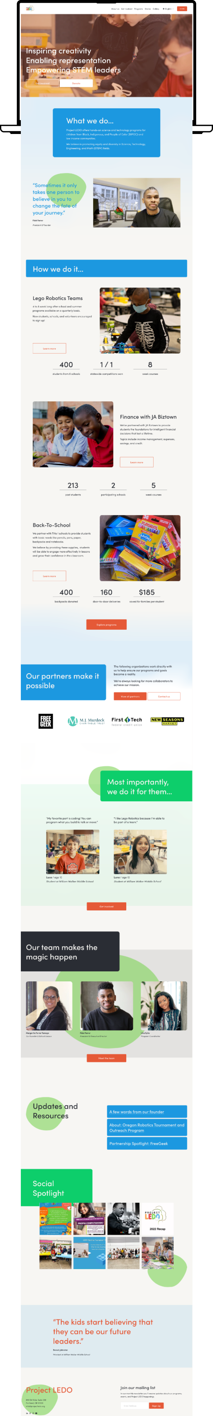
About Us Page
‘About Us’ is the main place to convey the mission, explore the team members, additional links to donate or become a partner and share the company history with a visually driven timeline.

Donate Page
One of the most important pages for Project LEDO is the donate page. We wanted to call attention to the primary CTA, the donate button, but also explain how certain amounts could make an impact. It was also important to list out all the ways people could give, as well as discuss future goals for the non-profit.

Volunteer Page
Site visitors are encouraged to explore the many options available for volunteering. We added more information about each position to ensure site visitors could get involved the way that best suited their time commitments and skills!

How did we do it?
To ensure an understanding of the pain points of the current website, we conducted a series of user interviews, user journey flows, a competitive analysis and completed a heuristic evaluation. Questions we we had in mind:
How do users feel when exploring the website?
What information do users want to know when browsing ways to get involved?
Can users easily find the ‘Donate’ button? Do they have the information they need to confidently donate?
Interview Findings
After surveying 4 participants, we synthesized the data and used affinity mapping to distill the following findings:
Participants were able to easily locate the Donation page. However, they were unclear as to where there money would be going. Some participants navigated to other pages, such as the 'Get Involved' page, to learn more about the ways in which their funds might make an impact.
Participants struggled to find key info they need to assess if they are able to volunteer. The sought certain information when deciding which program to volunteer for, including: time commitment, skills needed, and responsibilities included.
One participant was unsure what STEM meant, which indicated the need for an introduction somewhere.
Participants found the current visual design to be very flat with a lot of white. For a place which claims to be helping children, some more fun colors should be included to be striking and interesting.
User Journey Mapping
One of the primary user archetypes identified based on our research was potential volunteers. In order to visualize the site experience from their perspective, we created a series of journey maps to empathize and illustrate potential scenarios where they might interact with the website.

Competitive Analysis
While working with the founder of Project LEDO, Fidel Ferrer, he mentioned several non-profit sites as sources of inspiration including: Blanchet House, Linguava, and Charity Water.
Fidel appreciated the way Blanchet House communicates information to potential volunteers, how Linguava uses color, and how Charity Water makes an impact in communicating its mission.

Blanchet House excels in laying out all ways for people to get involved, so they can easily browse and choose what appeals most to them.

Linguava uses a bright green color (from their logo), and playful icons to communicate their visual design story.

Charity Water highlights the impact helped by a monetary donation, and details where money will go.
Heuristic Evaluation: Current Site Analysis
We reviewed the current Project LEDO website in depth, to determine what should be improved to meet both business and user needs. Overall, we found inconsistent formatting and a lack of information about the issues Project LEDO is trying to tackle.
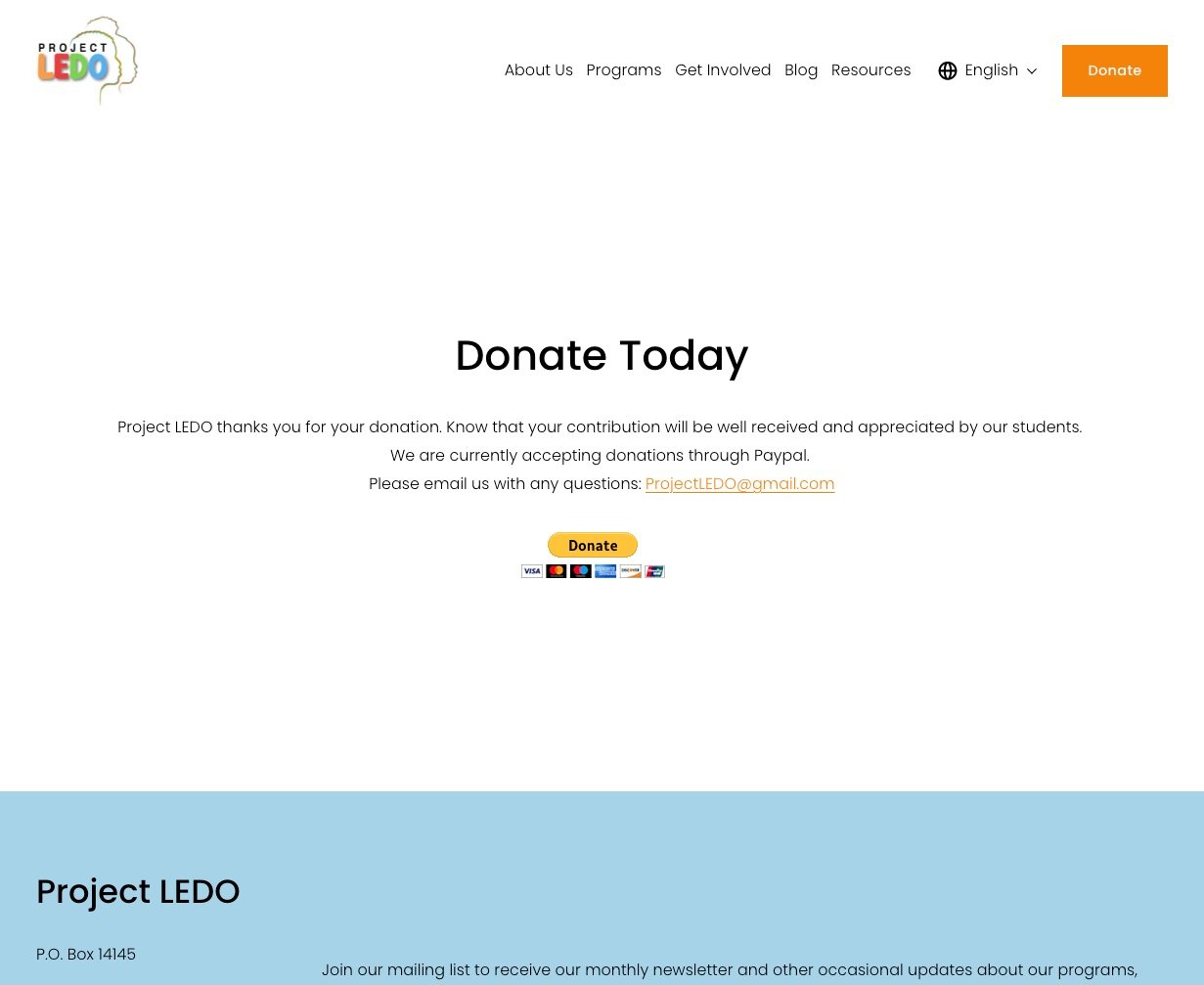
The ‘Donate’ page was easy to find, based on the bright orange call to action button on the main navigation tool bar, but the page itself had a lack of information on the impact an individual donation can have, as well as a lack of information about other ways people can help:

The ‘About Us’ landing page conveyed important information but large text blocks make it hard to quickly identify what Project LEDO is all about. In addition, the formatting was inconsistent. Introducing visual hierarchy could help tell a better story. There is also an opportunity to link to other parts of the site from here.

The ‘Get Involved’ page is helpful in communicating the different options of how a person can help. However, the specific information a person might need when deciding on different volunteer opportunities was no where to be found (time commitment, skills needed etc). Additionally, some of the information on this page felt better suited to the donation page. Lastly, the buttons on this page are all the same primary CTA color and is competing with the 'Donate' button at the top.
Research Questions
Design Process
With our research completed, we began to explore potential designs for the website. An important part of this process was building out a site map, to ensure we would be aligned as a team with what information should be included where. Also, it was determined that Squarespace would be used for the website, so our designs had to fit within the constraints of the Squarespace webpage builder.
Wireframing
To ensure our designs would be aligned visually, we created quick, low-fidelity wireframes within Miro. By using Miro, we could share our initial designs with staff from Project LEDO to get initial feedback. This would ultimately help us to decide what to include in the final designs, especially where copy was concerned.


Visual Design
With the functionality finalized, we moved on to decide what the visual design would look like. The founder wanted us to utilize as much color as possible, inspired by the logo.

The problem with using all colors of the logo is, they could easily compete with one another. We would need to utilize the colors smartly so as to not have competing CTA’s or use colors that could create a more alarming vibe (red, for example).
Also, I wanted to ensure our color choice, font sizes, and contrast were being chosen with accessibility in mind. We ran our colors through a contrast checker and decided to make small tweaks that would still capture the essence of the logo.
The solution was to combine the orange and red to create a burnt orange that could function well as a CTA. Darkening all colors helped to ensure good contrast and meet accessibility standards. We also introduced lighter colors for accents as needed.

As for other visual design elements, we utilized blocks and circular shapes to create playful moments and help bring more fun vibe to the website. We made sure to remove hard edges and introduced curves to most elements.
One element that was especially important was the hero banner on the homepage. I utilized existing footage and edited clips to create a gif that would greet site visitors. The goals of the gif was to show representation, connect emotionally with visitors, and give a holistic overview of the different programs offered. Watch the full gif footage here:
Takeaways
Volunteering with Project LEDO was a great experience for me. Within this project I learned a lot, but most notably, learned how to work effectively within real-world constraints and how to utilize storytelling in a compelling way.
Constraints: I was very excited to utilize my design skills amidst some real-world constraints. When we have limitations, we need to think more creatively to find ways to achieve our goals. In this case, working within the Squarespace web builder was a challenge we met with creative problem solving. For example, while Squarespace doesn’t allow for some of the features we initially imagined to address volunteer application needs, we ended up utilizing Google Forms to help fill the need of collecting application information from volunteers.
The importance of storytelling: Non-profits can rely on their stories to connect with their audience and get more people involved to take action. By including narrative moments in our new design and supporting them with visuals and videos, Project LEDO’s messaging could be more impactful, memorable, and help drive donations. I believe this project has helped me to develop more storytelling skills that will be helpful in other projects in the future.
What would I do with more time?
Given more time, I would love to monitor the site’s performance. Ideally, we would see an increase in site traffic, donations, new members and engagement. Adjustments to the site could be made depending on these numbers. I would also love to run further usability tests (beyond the tests we did with our fellow Project LEDO employees), to ensure our designs are user-friendly and easy to navigate. By utilizing A/B testing, we could determine which design elements are most effective.