The Wishper Tree
A three dimensional interactive visual art installation for a public space, which invites visitors to reflect on and share their wishes for the future.
My Role
UX Designer & Creative Director.
My responsibilities included concept design, sketching, lo-fi prototype design, and assisting with fabrication of hi-fidelity prototype.
My team and I collaborated on research, iteration, usability testing, and physical computing components.
Team
Mikaela Corney
Estelle Li
Rahmat Raji
Daniel Rodriguez
Timeline
10 weeks
(January - March 2022)
The Problem
Our Response
The Covid-19 pandemic forever changed our relationship with public spaces. How do we begin to inhabit spaces together again?
Our challenge was to design a new interactive digital-physical artifact, situated in physical space for physical interactions that would help us reconnect to one another and (re)experience places together. Our budget was $100.
An interactive system that invites visitors to take a moment to reflect, manifest their hopes, and connect with others in a new way.
Reflect
The Wishper Tree asks visitors to approach a megaphone area, and speak aloud their wishes, hopes, and dreams. Visitors watch as their messages are translated into light, then travel through a tube to settle in the tree.
Connect
When participants walk near the tree, the wishes can be heard, playing back. This facilitates feelings of connectedness when you realize you may hold the same hopes and dreams as others.
Inspire
By being vulnerable with one another and sharing with each other these wishes for the future, we can reconnect in a deeper way.
Overview of the design process. Video created and narrated by me.
How was it made?
Primary Research
Competitive Analysis
To learn more about existing interactive exhibits, we conducted competitive analysis research focusing on the goals of the exhibit, what was successful or unsuccessful, and how visitors might interact with exhibits in unexpected ways.
Competitive analysis research (Click Here to View).
Synthesis
Insights from Desk Research
Finding 1
The artifact should fit the immediate context.
The most successful permanent exhibits were connected to the immediate landscape and furthered a narrative.
Finding 2
The artifact should be intuitive or provide adequate instruction.
Confusing artifacts caused visitors to be unsure of how to interact with the system.
Finding 3
The most memorable artifacts connected with visitors on an emotional level.
The most talked about artifacts in our research seemed to connect with visitors on an emotional level. Many were whimsical, which visitors reported made them feel a sense of childlike wonder.
Ideation & Downselection
Concept Generation
Based on our design challenge and the findings from our competitive analysis, we came up with 5 design principles for what we wanted to achieve in our artifact: whimsical, innovative, interactive, covid friendly, & feasible.
From there, we individually came up with ~13 possible concepts, for a total of 50 ideas. We utilized dot voting as the initial downselection method.
Our total concepts captured here.
Downselection
Once we downselected to our top 10 ideas, we assigned the ideas either a “+” or “-”, scoring them on how well they met our 5 design principles: whimsical, innovative, interactive, covid friendly, & feasible. We tallied up the total points (“+” for plus 1, “-” for minus 1) to see which concepts scored the highest.
We scored ideas to see which ones best captured our design principles.
Initial Concept
Out of the top scoring ideas, the team agreed to proceed on my proposed concept, the Wishper Tree, based on our research, findings, and some initial feedback we received.
Risks: Some concerns were if the concept was covid friendly enough (it would require visitors to speak into a megaphone).
Also, how feasible could it be to build a tree? We would need to explore different ways to build something so large and intricate to ensure it had the impact we imagined.
Benefits: The concept was inspired by Wishing Trees, prominent in many different cultures around the world. I wanted to reimagine a wishing tree as an interactive and digital experience that would foster connectedness and manifest a shared, whimsical vision for a brighter future.
My initial sketch of the concept with fabrication brainstorms.
Lo-Fi Prototyping
Material and Form Exploration
With the consideration of building a tree, we needed to get a sense of how big we could go, and what materials could be used to make that possible. We also needed to explore input options for how visitors would interact with the tree.
For the megaphone, this meant lots of tests with code and electronics responding to voice as the input, and displaying lights as the output.
For the tree, we experimented with paper mache and getting creative with foam board and different connecting techniques: puzzle joints and interlocking slot joints. This ended up being a great success because we could utilize low cost material, and achieve a larger scale.
Usability Testing
We completed 2 usability tests to determine key features of our final design and ensure our visitor’s experience would be both intuitive and exciting.
The first test would evaluate the height at which people could easily speak into our megaphone.
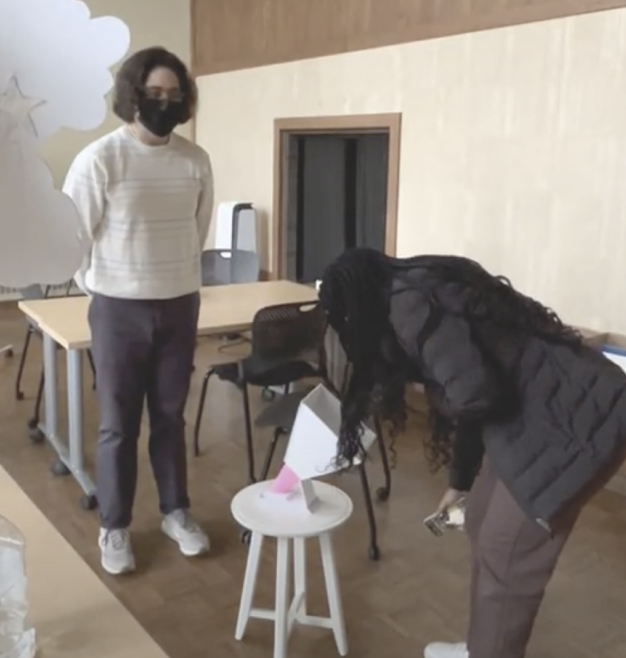
We ran multiple tests on the megaphone placement of “upward + low”, “downward + low”, “upward + high” and “upward + mid.”
Participants mentioned feeling uncomfortable if they could not reach the megaphone at an appropriate level: they did not want to feel as if they’d need to shout their wish.
For this reason, we decided on the placement of “upward + mid”. It was the most accessible to people of varying heights.

Megaphone Test: Upward + Low

Megaphone Test: Downward + Low

Megaphone Test: Upward + High

Megaphone Test: Upward + Mid
Our second test was on the amount of lights that would be displayed after visitors sent their wishes to the tree.
My initial concept encouraged only a single light per wish to display on the tree, conveying a sense of symbolism that the light/wish belonged to the individual, and over time, more lights would be added to the tree as more wishes were made. But would this single light idea be impactful and noticeable enough?
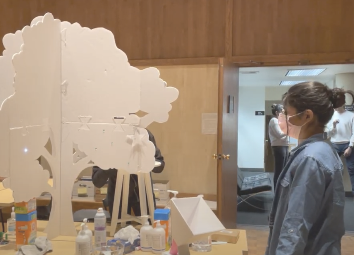
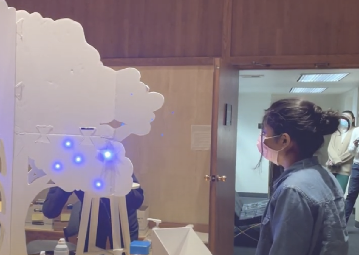
We decided to put it to the test, and watched as participants made wishes and reacted to one light vs a cluster.
In the end, while a few participants appreciated the symbolism of one light appearing, most said they were more excited for the cluster of lights. The consensus was it felt more exciting, and one participant said it gave them a “sense of wonder and significance.”

Testing reactions to a single light after a wish is made

Testing reactions to a cluster of lights after a wish is made
Final Design
Hi-Fidelity Prototype
With our tests and research validated, we moved to design and create the final version of our prototype.
The first step in building our final prototype was drafting a design in Rhino. To stay within our budget of $100 while achieving the scale we hoped for, we chose cardboard sheets as the final material. This also afforded us the possibility to laser cut our pieces for a clean finish.
-

The laser cut parts were designed with an alphanumeric organization system, so we wouldn’t get them confused.
-

Once we had the frame, we strategized and installed our LEDs. It involved a good amount of soldering.
-

I designed the megaphone out of foam sheets as a rose to match the organic nature of our concept. We also decided that flowers on our tree may evoke themes of spring, which is the season of hope and renewal.
-

We utilized tracing paper to diffuse where the lights would shine.
Outcome
With the pieces together, we unveiled our final prototype during an interactive artifact showcase.
Post showcase, the Wispher tree lives on at a local arts and crafts studio in Seattle.
Takeaways
Reflections & Considerations
More Usability Tests for Sound Playback Components
We unveiled the piece at a showcase, which had unpredictable background noise. During the event, we experimented in placing the “wish playback” speaker in different areas but it was either too quiet for guests to notice or too loud.
If we were to continue this project, I would want to complete more usability testing to ensure sound is heard in the right areas at the right times.
More Signifying Feedback
Visitors needed to push a button to “send” their wish to the tree. During the showcase, visitors would often push the button too many times. If time allowed, I would add some sort of audible or haptic feedback upon successful button press.
Privacy Considerations
For further development, a big consideration would be to make it less ambiguous that a guest’s privacy was secure. A number of guests asked if their wish would be recorded and added to the audio. In a higher fidelity prototype situation, we’d like to give visitors the option to record their wish and have it added to the playback audio. But regardless, it needed to be made more clear that no one was being recorded.


